Choosing a Day Without a Mouse: Auditing Date Inputs in Blue Badge Forms
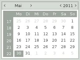
Photo: Gtk+ developers, LGPL, via Wikimedia Commons
Blue Badge applications are among the most consequential forms a council publishes. They combine identity details, eligibility evidence and dates that must be precise: a date of birth, the date a badge was issued, the date it expires. A date picker that works neatly with a mouse can still become a barrier when a keyboard, screen reader or magnification is the primary way through the form. The audit question is not whether the calendar looks tidy. It is whether an applicant can enter the required date, understand any constraint and recover from a mistake without abandoning the journey.
Begin with the label and the format
Before opening the calendar, inspect the field as a screen reader would. The label should say what date is needed, not simply 'Date'. A hint should give the expected UK format, for example DD/MM/YYYY, and explain any permitted range. Placeholder text is not a substitute: it disappears on entry and is inconsistently announced. Where day, month and year are separate inputs, group them with a fieldset and legend so the relationship survives linear navigation. Check that an autocomplete attribute or input type does not force a format that conflicts with the visible instruction. For Blue Badge renewals, the date of issue may be printed on the old badge; the form should make clear whether applicants can copy it exactly or must calculate something.
Test manual entry first
A calendar should be an aid, not the only route. Switch off JavaScript, or use the keyboard without ever pressing the picker button, and type a valid date. The field must accept it, validate it and submit it. This matters for older applicants, people using speech input and anyone who finds month-by-month navigation slow. Manual entry is also the cleanest fallback when a calendar widget fails to load. Confirm that typing does not trigger a popup that steals focus, and that leaving the field does not erase a correctly formatted value. If the service accepts only one separator style, test whether the error message explains that rule rather than merely rejecting the entry.
Follow focus through the calendar
Open the picker with the keyboard alone. Does focus move into the calendar, or does it remain on the trigger while the calendar appears elsewhere? If the picker behaves as a modal dialog, focus should be contained, Escape should close it, and focus should return to the trigger. If it is a popup grid, tab order should be predictable and the selected date should be announced. Arrow-key navigation is common but not universal; whatever pattern is used, it must be discoverable and consistent. Check the month and year controls: buttons labelled only with chevrons or '>' are ambiguous to screen reader users. Labels such as 'Previous month' and 'Next month' give the control meaning. When the month changes, a polite live announcement can help, provided it does not interrupt every keystroke.
Make distant dates reachable
Blue Badge forms often ask for dates that are years away from the current month. A picker that offers only previous and next arrows can require dozens of interactions to reach a birth year or a future expiry date. Direct month and year selection, or a well-labelled dropdown, reduces that burden. Test the extremes: the earliest permitted date and the latest. Check that disabled dates are explained, not merely greyed out. If the service restricts a date to a particular window, the hint and error message should state the window in plain English. Screen reader users also need to know the current month and year when the grid opens; a heading that changes visually but not in the accessibility tree leaves them without context.
Treat error recovery as part of the component
Enter an impossible date, such as 31/02/2026, and observe what happens. The error should be associated with the date field, announced when focus reaches it, and phrased as guidance rather than blame. The applicant's other answers should remain intact. If the calendar marks a date as unavailable, the message should explain why. Check that an error summary links back to the field and that focus moves to the summary or the first invalid field in a predictable way. Test a date outside the allowed range as well as a malformed one; these are different failures and need different messages. Preserve entered values after validation so that a single mistake does not force the whole form to be completed again.
A short audit routine for council teams
Start by listing every date field in the Blue Badge journey, including those in supporting evidence sections and parking permit cross-links. For each one, record the label, hint, format and any range restriction. Then run the same sequence: manual entry with JavaScript disabled; keyboard-only entry and calendar navigation; screen reader announcement of label, hint, selected date and month change; 200 per cent zoom and a narrow viewport; mobile touch targets; and error recovery with both malformed and out-of-range dates. Capture the browser, assistive technology and operating system used, because a defect that appears in one combination may not appear in another. Finally, note whether the calendar is essential. If it can be removed without losing function, that is often the most robust fix.
What good looks like
A dependable date input is unremarkable in the best sense. It states the format, accepts typed entry, offers a calendar as an optional convenience, lets users move between months and years without repetitive clicking, and explains mistakes without discarding work. For Blue Badge applicants, many of whom are older, disabled or applying under time pressure, those details are not refinements. They determine whether the form is usable at all. In 2026, with councils under pressure to digitise more services, the date field deserves the same scrutiny as eligibility rules and evidence uploads. An audit that follows focus, tests the manual route and insists on clear recovery will catch failures that a visual check alone will miss.